... not just because I realised I didn't have a clear idea of the room I was building, so spent some time over lunch playing with options and feeling no closer, but also because Instagram refused to post my post documenting the options and is holding the photos hostage until it does, and because while I was retaking the photos of the options to blog them, I knocked the temporary set up and it fell apart 🙄
Now that I have the hero shot for thumbnails, let's have a look at the loose options I came up with so far: your suggestions are most welcome!Option 1:
Here I was trying to leave the dresser set up how it was in Saturday's photo, against (what will be) a white wood-paneled wall, and was trying to fit the other objects I thought I'd use roughly where they'd go, in a way that made sense, especially as I wanted to include a 'picture wall' above the desk (you'll see this follow the desk around in every option).I'm using a false window which means it can be easily moved as needed, and suspect I'm pushing things trying to include the round marble tables from Kmart that I blogged about last week, but they're new and I want to play with them.
In this option I feel I'm sailing perilously close to the whole 'chair next to something' approach I was trying to avoid, and feel that the desk is somewhat hemmed in (which would be fine if I decided that who lives here is a young person with little room to spare).
Option 2:
I moved the dresser (because it's my scene and I can. Or can pretend that Saturday's shelfie just missed the fact that the dresser was so close to the wall!), and swung both the bed and desk around. The reading chair and marble tables are obviously somewhere outside of the photograph's reach.It still fits within the bounds of realism based on Saturday's photo, but does it work?
Option 3:
This feels like it might work, but alas, we've lost the marble-look side tables. I'd love to add another window above the desk but I still have my heart set on that picture wall there.(It was about now that I realised that I probably should have factored in a bookcase right from the beginning).
Option 4:
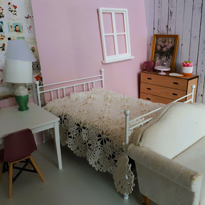
I moved the rocking chair to be at the end of the bed, nearer to the desk, meaning that the room is more clearly split into work zone and rest zone.Option 5:
The final change was swapping out the wicker rocking chair with a sofa that I picked up very cheaply years ago. Then I grabbed some lunch and logged back in to work for the afternoon.But I spent the afternoon wondering: is this a bedroom at all? Was I mislead by the dresser? Is it, in fact, a lounge, or perhaps even a studio? If it is a bedroom, would the bed be better approached as a day bed?
Perhaps I need to take a step back and contemplate who lives here?


I read your blog since a long time now and enjoy the posts frequency for this year’s beginning - thanks a lot for sharing ! Leaning towards option 2 and the studio option speaks to me a lot… eager to see what you will do ! Mini ElleAime from Paris
ReplyDeleteHello again Mini ElleAime from Paris
ReplyDeleteThank you for your kind words and I'm enjoying being back in the swing of blogging and hope I can keep up, if not (almost) daily posts this year, at least a couple of times a week. Fingers crossed!
Although I was strongly leaning towards the studio option it seems that assuming the person who lives here is single, tucking the bed against the corner wall may have solved the problem :-)