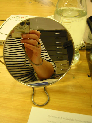
 We started by drawing self portraits "pulling different facial expressions from different angles and using a variety of mark making materials* and techniques ." Number three (charcoal) is the only one you're going to see:
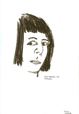 The next step (after eating banana and walnut muffins to celebrate two classmates' birthdays) was "recognisable self portraits using colour schemes that attempt to elicit the following responses from the viewer.
A) Joy/ pleasure
B) Fear/ anxiety
C) Revulsion/ sickness"
Here's my "Joy/ pleasure". (It obviously worked because every time the teacher looked at it he burst out laughing. I told him off.)
I had the sudden idea to take the collage I did on Saturday night and play with it a bit further.
First I penciled in the basics: the rocket and the figure inside it, inserting my head which I copied from the photo in the collage instead of the original one. Then I blocked out the main colour parts in bright, primary, happy colours (utilising the texture of the board behind it in the drawing):
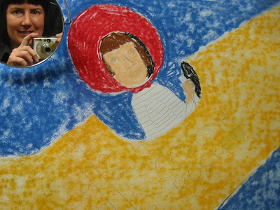 I fixed the pastels before continuing, filling in the colour of the rocket and the helmet (after adding a few more sheets of padding behind the picture to smooth things out). I added colour over the black shadowed areas and other coloured details:
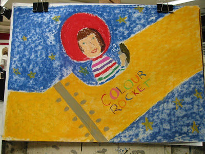 Another round of fixative before I added black edging:
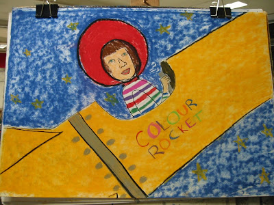 It's not finished yet but I was running out of time and still had the other pieces to do. I hope to get back to it soon (especially as I suddenly realised the rocket is just crying out for a set of training wheels!)
"Fear/ anxiety" started with Self portrait #3 above as I thought it would work quite well with the theme. I penciled it in large, covering the whole left side of the page (giving myself a nose-job in the process):
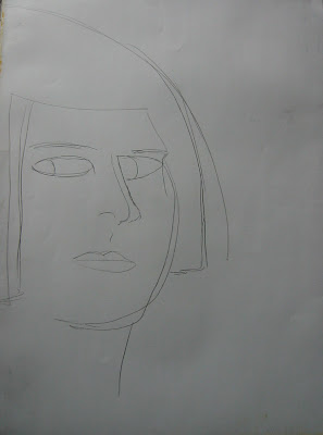 Since the whole "block it/ fix it/ add detail/ repeat" experiment worked so well with the first picture I tried it again here:
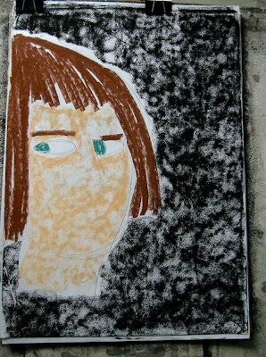 (once again using the texture of the board backing to create a sort of scumbled effect.)
Layer two with details:
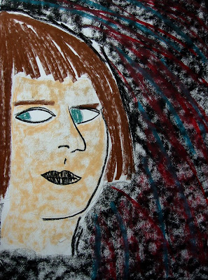 I wanted a chaotic, jarring background but also some cohesion in the piece so I used the teal of my eyes (since there was no "hazel" pastel in the box) and the red I was going to use on the lips. Which I know from class last week are two colours that provide simultaneous contrast (ie: if you put them next to each other the edges tend to jump around)
And on to layer three:
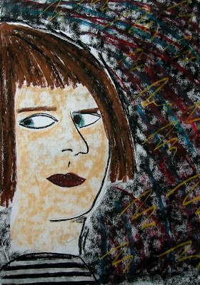 where, once I added the lipstick, the stripy shirt and the yellow zigzags, I suddenly realised I'd transported myself back to the worst of the early 80s. I may have, in fact, just drawn Little Nell...
(*art speak for pencils, pens, charcoal, crayons, pastels etc)
1 comment :
See. You and colour. Made for each other.
Post a Comment